

Librería

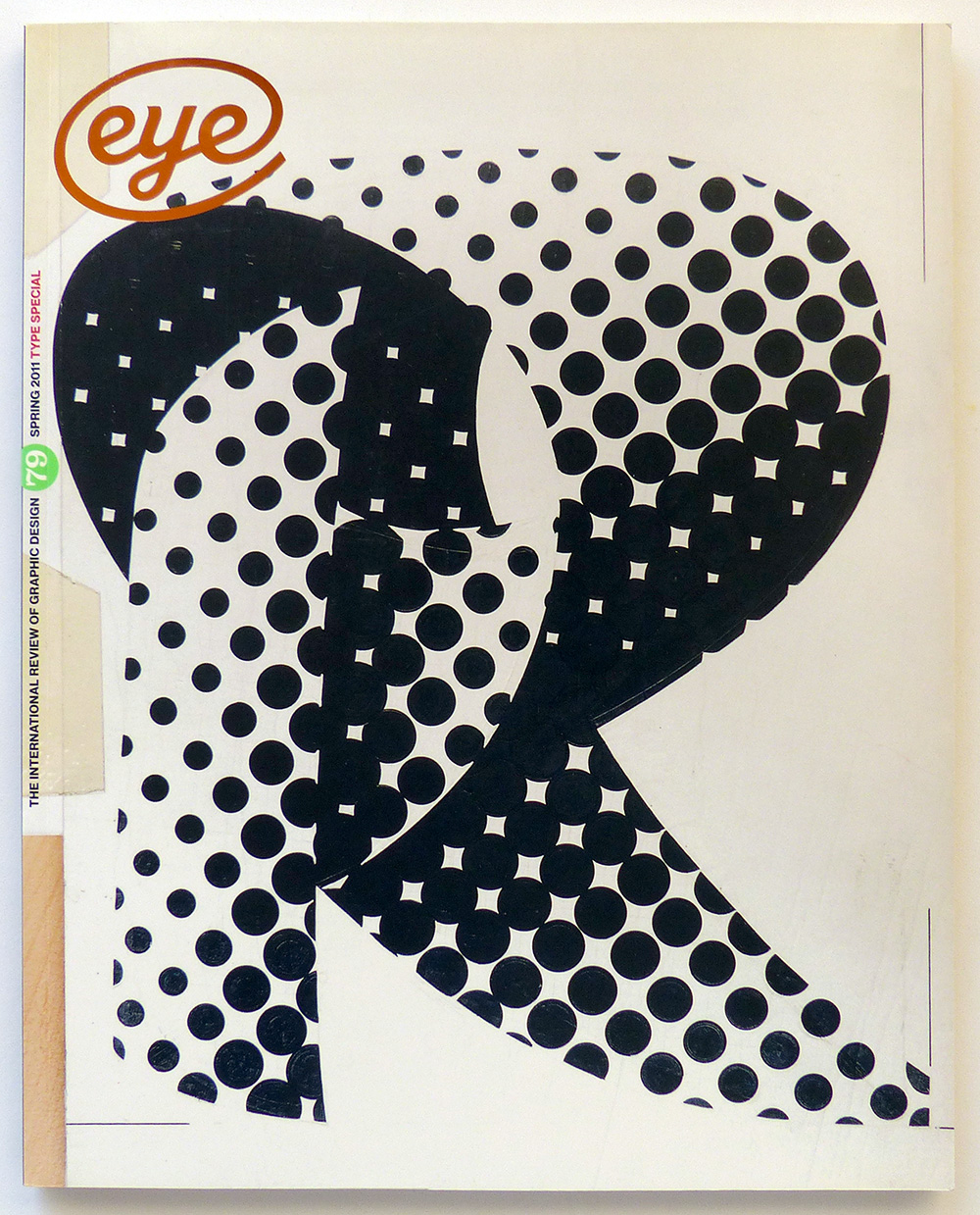
VV.AA. – Eye. The international review of graphic design, nº79
London – 2011
Autor: VV.AA.
Estado: Bien
Formato: Encuadernación de tapa blanda
Idioma: Inglés
Editorial: Eye Magazine Limited
Formato: Formato en 4°
20.00€ IVA Incl.
Vendido
Descripción
Published by Eye Magazine Limited, 2011 London. Type Special. 4ºM (30×24 cm) 110 págs. Rústica ilustrada. Cubierta algo deslucida. Muy buen estado general. OPINION – Editorial eye 79, John L. Walters. One of the fascinating things about type is its dynamic nature. Take any era and. – Kiki in graphic detail. Rick Poynor. Catel’s quick-fire sketches illustrate the life of the young model who became a Surrealist icon and Man Ray’s muse. Critique by Rick Poynor – New dawn. Monitor, Jack Yan examines the future of webfonts and the digital marketplace FEATURES – Modern method. Kerry William Purcell. As the Design Museum launches a retrospective of Wim Crouwel’s work, Kerry William Purcell interviews the Total Design (TD) co-founder. – In the thick of it. John L. Walters. Morag Myerscough puts an eclectic graphic sensibility into public spaces, with colour, pattern and big type – Reputations: Kris Sowersby. Mark Thomson. ‘New Zealand is a young country and hasn’t had the time, or resources to develop a typeface culture. I am free to draw upon multiple influences. I haven’t been taught or exposed to any one particular typographic heritage, so my hand isn’t biased.’ – Allan Fleming: The man who branded a nation. Martha Fleming. At a pivotal moment in Canada’s history, Allan Fleming’s typographic designs for stamps, books, advertisements, logos and big civic projects shaped the look of the country, leaving a vital legacy – Beyond Blackletter. Steven Heller. The lettering on the covers of Germany’s most popular film magazine expressed plot and tone with exuberant, readable forms. – Food, type, art director and client. Dominic Hofstede. Les Mason art-directed The Epicurean, Australia’s first food and wine magazine, as an expressive gallery for adventurous graphic design. – Raise the bar. Adrian Shaughnessy. Uncompromising posters for the Théâtre Nanterre-Amandiers in Paris – Mr Mistral. Sébastien Morlighem. New discoveries about Roger Excoffon’s virtuoso typefaces for Fonderie Olive prompt a fresh look at the legacy of this dynamic designer and the foundry itself. – Men behaving stylishly. John L. Walters. Who would dare to launch a glossy men’s magazine during an economic crisis? The team behind Port discuss their new quarterly – Port: Prêt à porter. John L. Walters. Jeremy Leslie, Port’s iPad app designer, explains his methods – Buying time. Steve Rigley. With shorter, more commercially driven degrees under serious consideration, Steve Rigley argues that design students need more space to speculate and make mistakes. REVIEWS – The Design of Understanding – Clip / Stamp / Fold – Green Patriot Posters – I Swear I Use No Art At All – Artists’ Magazines – I See the Promised Land – Fanzines – Gerd Arntz: Graphic Designer – Born Modern: The Life and Design of Alvin Lustig – Typographic Matchmaking in the City
Otros datos
| Peso | 0.65 kg |
|---|
Productos relacionados

VV.AA. – Memoria de la seducción. Carteles del siglo XIX en la Biblioteca Nacional.
30.00€ IVA Incl.
ROSELL I MIRALLES, Eugeni (versión castellana) – Etiquetas.
13.00€ IVA Incl.
Apesteguía Velayos, Gregorio – (Otras) Reglas para la dirección del espíritu
6.00€ IVA Incl.
PACKARD, Vance – Las formas ocultas de la propaganda.
22.00€ IVA Incl.


