

Librería

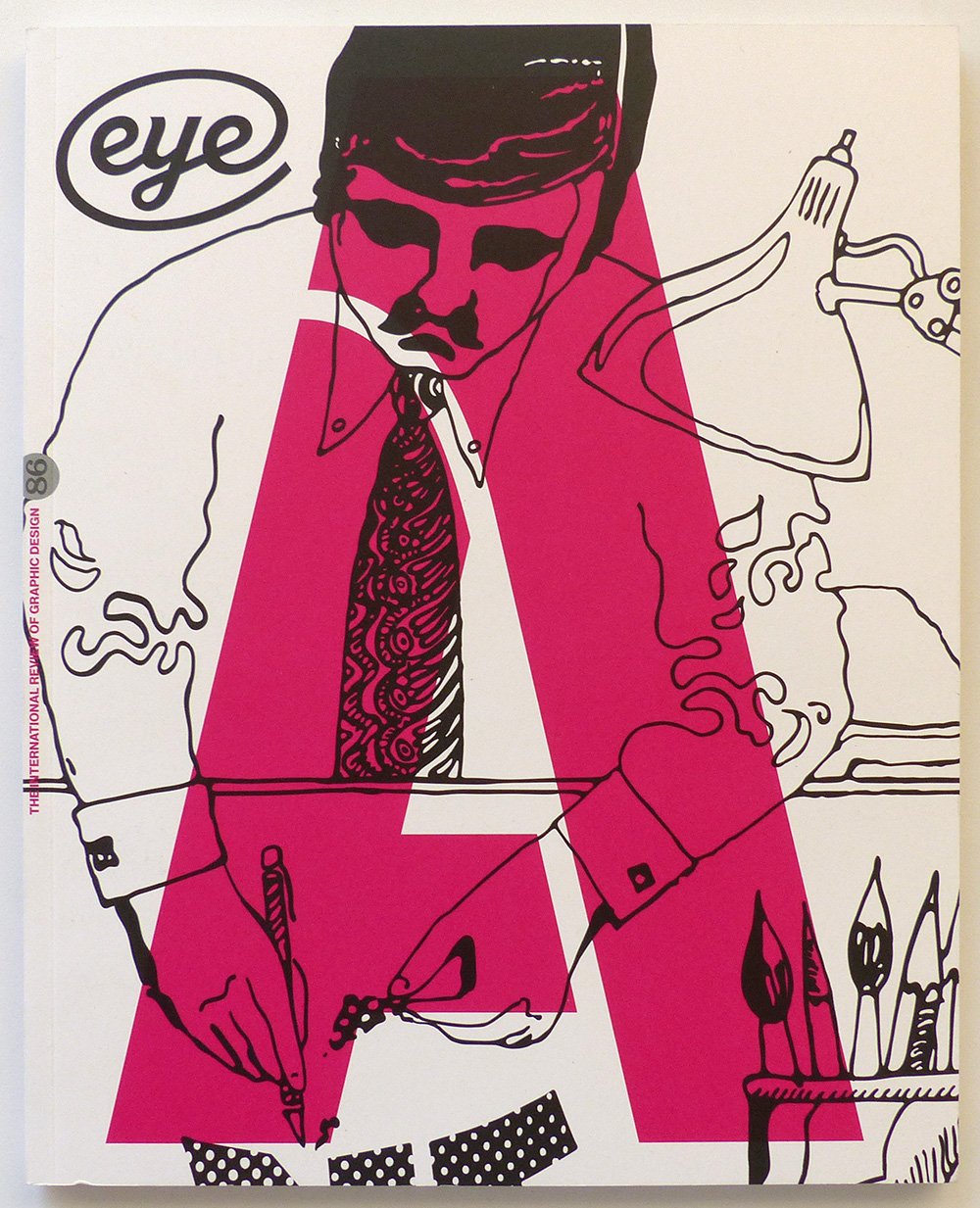
VV.AA. – Eye. The international review of graphic design, nº86
London – 2013
Autor: VV.AA.
Estado: Bien
Formato: Encuadernación de tapa blanda
Idioma: Inglés
Editorial: Eye Magazine Limited
Formato: Formato en 4°
20.00€ IVA Incl.
Vendido
Descripción
Published by Eye Magazine Limited, 2013 London. Vol.22. 4ºM (30×24 cm) 108 págs. Rústica ilustrada. Cubierta algo deslucida. Muy buen estado general. OPINION – Editorial Eye 86. John L. Walters. This type special contains several examples of letters that lie some way off the usual. – Incisive vision. Rick Poynor. Eduardo Paolozzi’s gifts as a collagist have been neglected by the worlds of both art and design. Critique by Rick Poynor FEATURES – Reputations: Tony Brook. John L. Walters. ‘What other profession do you end up in where you learn so much about other people’s businesses than in graphic design? It’s remarkable. Clients will tell you everything. It’s like being a therapist. That’s really exciting. You never know what’s going to happen from one week to the next.’ – Tony Brook on collecting. Spin’s founder, the subject of Reputations in Eye 86, talks about his passion for poster collecting – Quiet man of letters. Catherine Dixon. Alan Bartram brought a perceptive eye to alphabetic detail in public spaces. Catherine Dixon pays tribute to the co-author of An Atlas of Typeforms – An Atlas of Typeforms. Simon Esterson. As a sidebar to ‘Quiet man of letters’, Simon Esterson talks about his early encounters with this celebrated book by Alan Bartram and James Sutton – A tradition with breaks. Eric Kindel. Stencil typefaces – late arrivals on the typographic scene – are going in new directions and rediscovering their history. – Painted thrills and spills. Caroline Roberts. Fred Fowle was the UK’s foremost fairground artist. His go-faster graphics and futuristic lettering live on – in museums and working steam fairs – Type specific. Eye editors. TDC hails the wider world of empathetic wine labels, typographic IDs and retro stationery – Vapour trails. John Coulthart. Steampunk’s florid industrial nostalgia might yet be the defining aesthetic of our time – Rub-down revolution. Jane Lamacraft. A generation before home computers, Letraset’s dry transfer lettering made desktop typography possible – and gave a small group of type designers new insights into letterform construction through the art of stencil-cutting – The accessible elite. Linda Kwon reports on a design conference that aims to fight the ‘velvet rope syndrome’ REVIEWS – Pop Art Design – Dynamic Identities: How to Create a Living Brand – Hello World: Where Design Meets Life – Sounding the Body Electric: Experiments in Art and Music in Eastern Europe 1957-1984 – Branding Terror: The Logotypes and Iconography of Insurgent – Groups and Terrorist Organizations – Kawaii! Japan’s Culture of Cute – Sky Arts Ignition Memory Palace – Memory Palace – Signs for Peace: An Impossible Visual Encyclopedia – Sun Ra + Ayé Aton: Space, Interiors and Exteriors – Brooklyn Babylon – 50 Years of Graphic Design – Jazz: New York in the Roaring Twenties – Power to the People: The Graphic Design of the Radical Press and the Rise of the Counter-Culture, 1964-1974 – Dekho: Conversations on Design in India – Dixonary
Otros datos
| Peso | 0.65 kg |
|---|
Productos relacionados

VV.AA. – Memoria de la seducción. Carteles del siglo XIX en la Biblioteca Nacional.
30.00€ IVA Incl.
BERNARD, François – SEB Magefesa. Por aquí, la buena cocina… a la manera de François Bernard
6.00€ IVA Incl.
MUNARI, Bruno – El arte como oficio
10.00€ IVA Incl.
Norberto Chaves, José Luis Pinillos, Camilo José Cela, Cristina Santamarina, Nelly Schnaith y Enric Satué – Publicidad española de los 80.
17.00€ IVA Incl.


