Librería

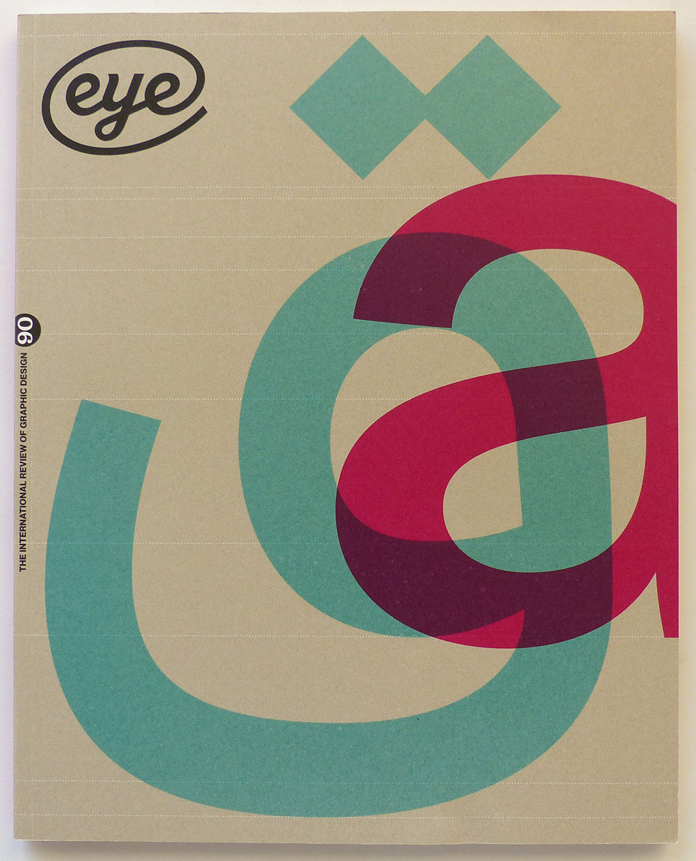
VV.AA. – Eye. The international review of graphic design, nº90
London – 2015
Autor: VV.AA.
Estado: Bien
Formato: Encuadernación de tapa blanda
Idioma: Inglés
Editorial: Eye Magazine Limited
Formato: Formato en 4°
20.00€ IVA Incl.
Vendido
Descripción
Published by Eye Magazine Limited, 2015 London. Vol.23. 4ºM (30×24 cm) 112 págs. Rústica ilustrada. Cubierta algo deslucida. Muy buen estado general. OPINION – Editorial Eye 90. Type Tuesday, Typography, John L. Walters The wider world’s interpretation of type and typography can be broad, vague, prejudiced, opinionated, highly. – Online rhetoric. Visual culture, Rick Poynor. Though intended to make its contents ‘democratic’, art website The Space is a perplexing jumble. Critique by Rick Poynor FEATURES – Reputations: Fred Smeijers. Mark Thomson. ‘My father was a mechanic. Respect – for tools and for the material with which you work – is one thing I got from him. When the chisel is not sharp enough to do a certain job, even if it is just one cut, do not think you can get away with it. Sharpen the chisel properly and only then use it for what you wanted to do.’ – Moscow by type. Kat Phan. For the underground railway of Russia’s capital, wayfinding experts City ID commissioned A2-Type to make the Metro’s first typeface and pictogram system – Writing the city. Sam Roberts, Lara Cécile Krüper. Signwriter Pete Hardwicke has left his mark on a significant area of London – James Mosley: A life in objects. Paul Barnes. Through his ideas, collecting and dogged research, the former St Bride librarian has shown that printing history can be both lively and opinionated. The world of typography owes him a great debt – Four seasons. Sarah Snaith. Micha Weidmann’s art direction for a cookbook by London chef Ollie Dabbous, with photographs by Joakim Blockstrom – Beyond Latin. Gerry Leonidas, John Hudson, Neelakash Kshetrimayum, Kamal Mansour, Pascal Zoghbi, Eye critics. As digital tools liberate type design from arcane limitations, more people become free to communicate using their own alphabets and languages. Gerry Leonidas chairs a panel of designers discussing the global state of ‘non-Latin’ type – Counter intuition. Cyrus Highsmith. A short type design course will never turn you into a type designer. But it may make you a better typographer REVIEWS – Earthquakes, Mudslides, Fires & Riots: California & Graphic Design, 1936-1986 – Wilhelm Deffke: Pioneer of the Modern Logo – The Eternal Letter – Digitale Keilschrift / Digital Cuneiform – Outdoor Gallery – New York City – Office Romance – The Debate: The Legendary Contest of Two Giants of Graphic Design – 100 Great Children’s Picturebooks – Art & Design Graphique: Essai d’histoire visuelle. 1950-1970 – GraphicsRCA: Fifty Years and Beyond – Manuals 2: Design & Identity Guidelines – Graphic Details: Confessional Comics by Jewish Women – Southeast Asian Comics – 100 Years of Swiss Graphic Design – The Grand Budapest Hotel
Otros datos
| Peso | 0.65 kg |
|---|
Productos relacionados